Average Salary In London By Borough | Which Areas Pay More And Why
Looking up average salary in london by borough? this guide explains which areas pay more, why rankings shift, and how affordability changes the picture.
Author:James RowleyApr 14, 2026383 Shares23.9K Views
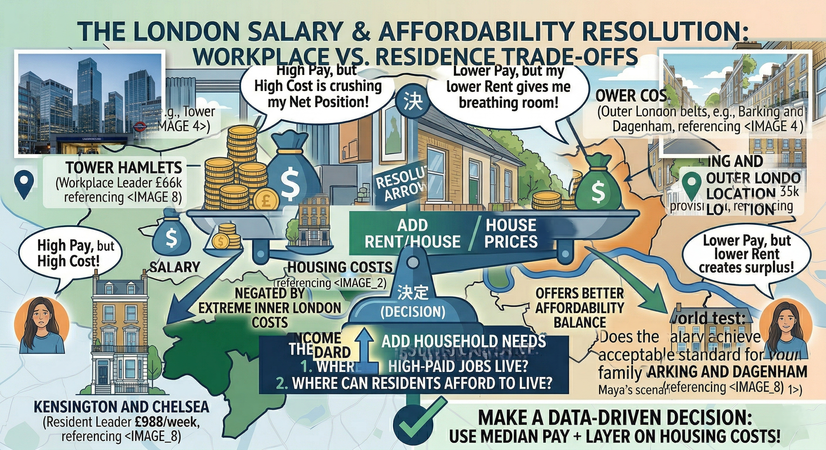
Average Salary In London By Borough: Which Areas Pay More And Why
If you search this topic because you want a clean number, Londonmakes that difficult. The city has official borough pay data, but the answer changes depending on whether you mean where people work, where they live, or what households bring in overall.
That difference matters. A borough can look highly paid on a workplace basis because it concentrates high-value jobs, yet look less impressive on a resident basis, and still feel punishingly expensive once rent or house prices enter the picture.
The most useful way to read borough salary data is not as a bragging-rights league table, but as a decision tool: which measure answers your question, and what does that number mean in real life?
The official London Datastore and ONS sources support that approach because they publish separate earnings series and explain their limits clearly.
Key takeaways
- There is no single average salary in London by boroughfigure that answers every question. Workplace earnings, residence earnings, and household income describe different things.
- Median pay is the safer benchmark for borough comparisons. ONS and the London Datastore prefer it because very high earners can distort the mean.
- Borough pay is only half the story. London had the highest regional house-price-to-earnings ratio in England and Wales in 2025, at 10.6.
- A good salary in London depends heavily on housing and household type. Trust for London says a single adult in Inner London needs about £54.4k a year for a minimum acceptable living standard.
How To Read This Page
The figures in this article do not all come from one harmonised same-year dataset, so they should not be read that way.
- Workplace borough pay:ONS ASHE via London Datastore, 2025, provisional.
- Resident borough pay: London Datastore borough residence spreadsheet, currently running to 2024 in the borough-formatted file.
- Household income: Trust for London borough-level measure, based on 2022/23 estimates.
- Affordability and rent context:newer housing and affordability sources may use 2025 or 2026 reference periods.
ONS also says that 2025 ASHE figures are provisional, and that data from 2023 onward might not be directly comparable with 2022 because of methodological changes. Every table in this article should therefore keep its source, metric, year, and status visible.
Quick Facts Readers Usually Want First
- The highest workplace-based borough pay in the latest verified borough file is in Tower Hamlets at £66,686.
- The lowest workplace-based borough pay in that same file is Bexley at £35,187.
- The latest borough-formatted resident file available on the London Datastore currently runs to 2024, with Kensington and Chelsea at £988.0 weekly full-time resident pay and Barking and Dagenham at £744.1.
- Workplace pay tells you where higher-paid jobs are located. Residence pay tells you what employees living in a borough typically earn.
- 2025 ASHE estimates are provisional, so current borough comparisons should always say so.
The fastest way to misread London borough salary data is to treat workplace pay, resident pay, and household income as if they were the same metric. They are not, and borough rankings can change sharply when you switch from one to another.
The Quick Answer On The London Borough Pay
The goal here is simple:give you the fast answer without flattening the real picture. If you remember one thing, remember that the ranking depends on the metric.
The Borough Gap Is Real, But The Metric Changes The Ranking
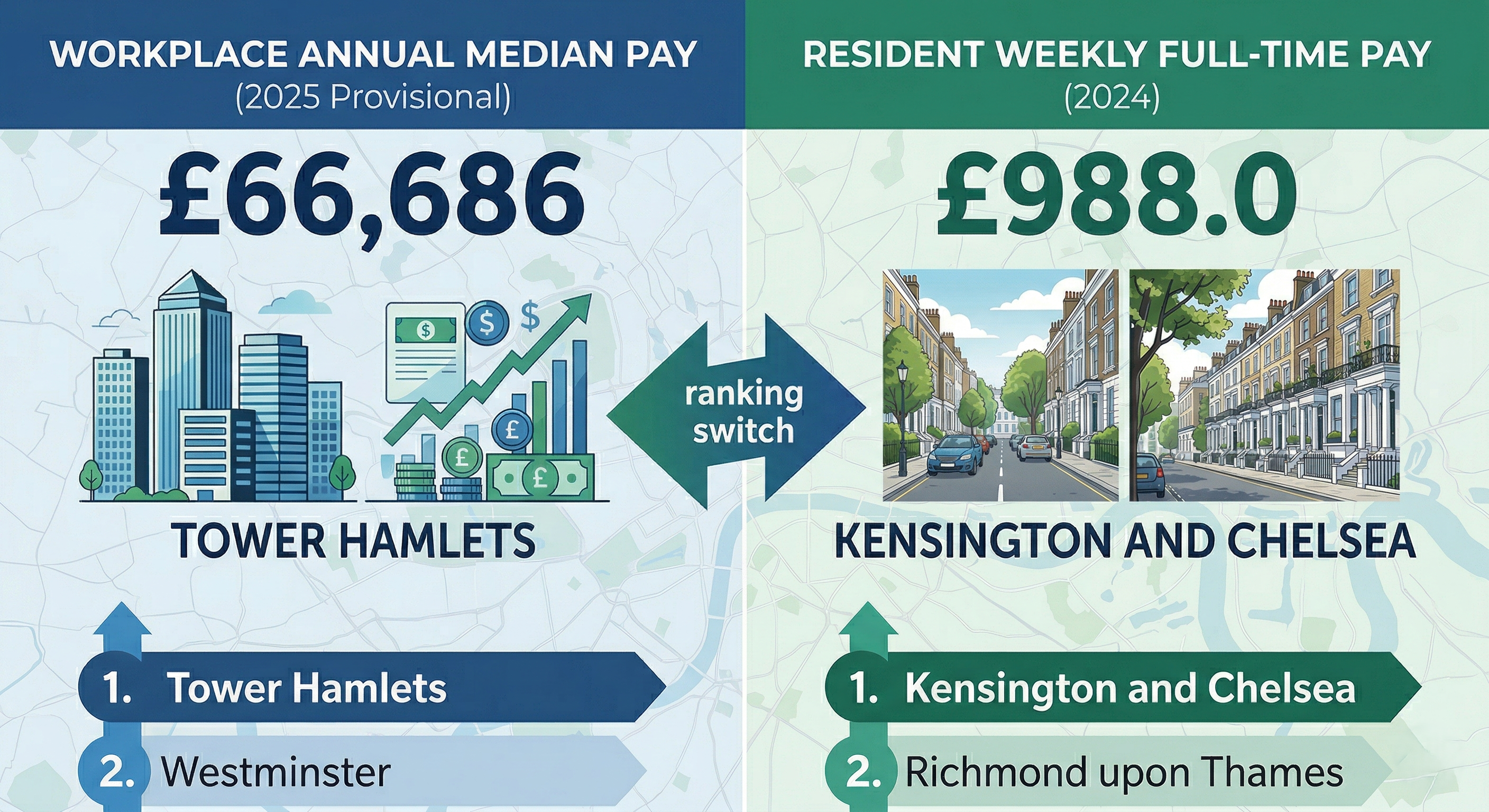
Official London data still shows a large borough pay gap, but the strongest current example should come from the latest borough-level file rather than an older summary answer.
In the official 2025 workplace annual median pay table, Tower Hamlets leads at £66,686, followed by Westminster (£53,923), Camden (£53,577), and Islington (£53,185).
At the lower end of the same table sit Bexley (£35,187), Redbridge (£35,464), and Waltham Forest (£37,503). These are workplace figures, so they describe what jobs in those boroughs pay, not what residents living there earn.
If you want a resident contrast, the latest borough-formatted London Datastore residence file currently runs to 2024, not 2025.
In that file, Kensington and Chelsea sits at £988.0 a week for full-time resident pay, Richmond upon Thames at £962.0, while Brent (£747.6) and Barking and Dagenham (£744.1) sit near the lower end.
That is exactly why the article should stop readers from treating workplace and residence figures as interchangeable.
The Three Salary Lenses Readers Keep Mixing Up
Here is the cleanest way to separate them:
| Measure | What it answers |
| Residence earnings | What do employees living in this borough typically earn? |
| Workplace earnings | What do jobs located in this borough typically pay? |
| Household income | How much gross income does the average household in this borough receive? |
The official London Datastore pages explicitly separate workplace and residence earnings, whereas the Trust for London’s household-income indicator is a different measure.
Why Median Matters More Than Mean
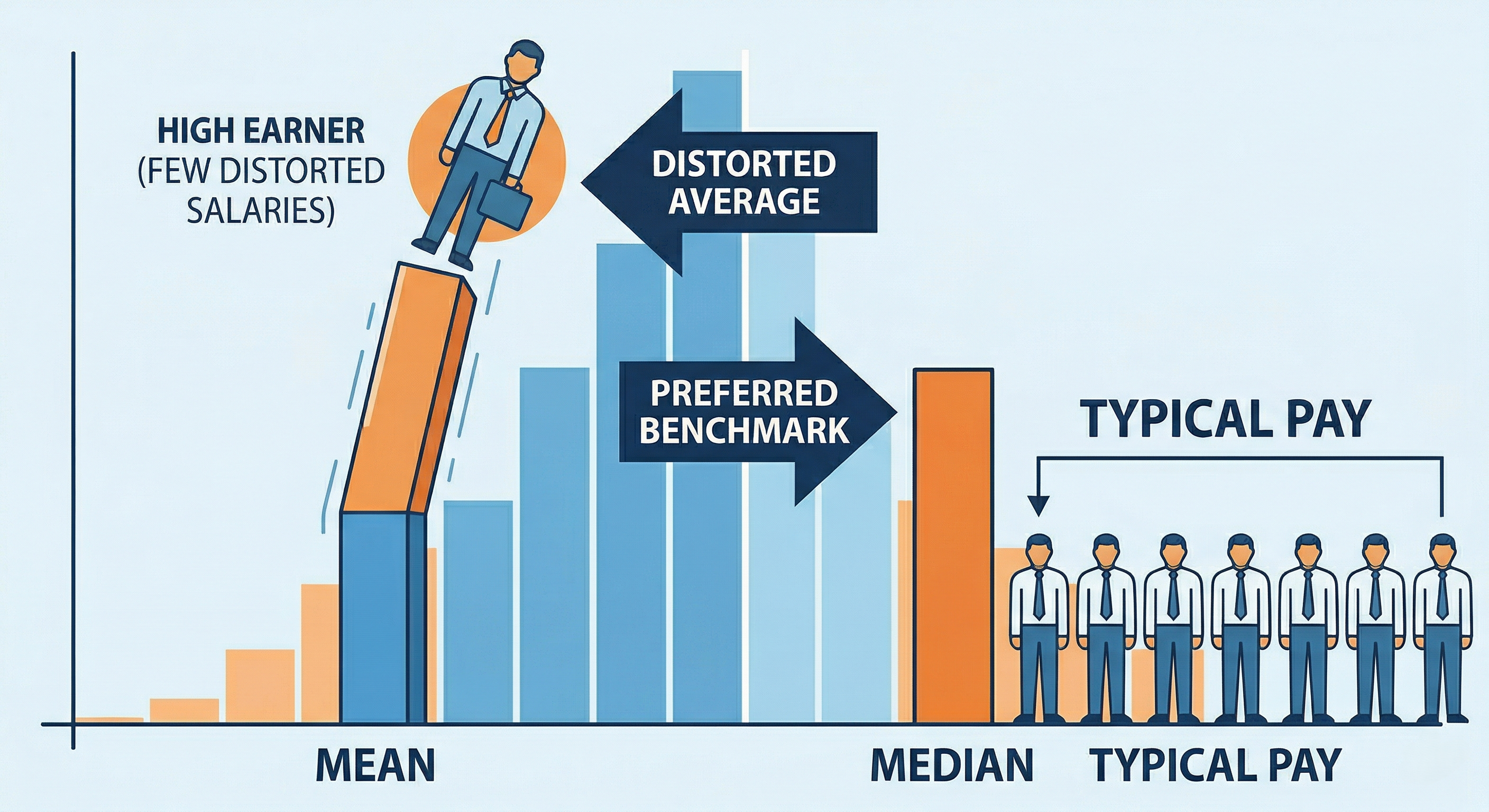
For borough comparisons, the median is the better default. Office for National Statisticssays median earnings are its preferred average because they are less affected by a small number of very high earners and therefore give a better sense of typical pay.
That matters a lot in London. In places with clustered finance, professional, or executive jobs, a mean figure can look richer than everyday experience. Median keeps the article anchored to what a typical employee is more likely to see.
Takeaway:Before you ask which borough pays more, decide which official measure actually fits your question.
Average Salary In London By Borough At A Glance
I pulled together ONS borough workplace earningsdata, official comparison points, and I will show you how to read them without mixing apples and oranges.
The Primary Borough Comparison Table
To satisfy the main search intent quickly, the article should show one clean borough table near the top.
The strongest directly verifiable borough-wide table I could extract is the official 2025 workplace annual median pay file from the London Datastore, which is based on ONS ASHE data and currently runs through Dec 2025.
These are workplace figures, so they show what jobs located in each borough typically pay, not what residents living there earn.
Source:ONS ASHEvia London Datastore Metric: Full-time workers, annual median pay, workplace-based Year: 2025 Status: Provisional
| Borough | Median gross annual pay |
| Tower Hamlets | £66,686 |
| Westminster | £53,923 |
| Camden | £53,577 |
| Islington | £53,185 |
| Hammersmith and Fulham | £50,435 |
| Southwark | £50,000 |
| Hackney | £48,724 |
| Lambeth | £48,690 |
| Kensington and Chelsea | £45,600 |
| Newham | £44,347 |
| Bromley | £43,474 |
| Hounslow | £43,068 |
| Wandsworth | £43,035 |
| Lewisham | £42,962 |
| Haringey | £42,609 |
| Kingston upon Thames | £42,346 |
| Hillingdon | £41,422 |
| Havering | £41,054 |
| Richmond upon Thames | £41,037 |
| Enfield | £40,036 |
| Croydon | £40,033 |
| Sutton | £39,874 |
| Barking and Dagenham | £39,599 |
| Ealing | £39,483 |
| Harrow | £39,192 |
| Merton | £38,471 |
| Brent | £38,311 |
| Barnet | £38,294 |
| Greenwich | £38,128 |
| Waltham Forest | £37,503 |
| Redbridge | £35,464 |
| Bexley | £35,187 |
The Primary Borough Comparison Table (Resident Earnings First)
The most useful borough-first snapshot for readers is usually resident earnings, because most people searching this topic are asking what residents in a borough tend to earn, not what firms in a central business district pay.
Here are selected official comparison points that help frame the picture:
| Official comparison point | Figure |
| Resident median hourly earnings, the lowest borough in the Mayor’s 2020 answer | Barking and Dagenham: £13.10/hour |
| Resident median hourly earnings, the highest borough in the Mayor’s 2020 answer | Kensington and Chelsea: £22.33/hour |
| Average gross household income, the highest borough in the Trust for London’s latest view | Richmond upon Thames: about £101,973 |
| Average gross household income, lower-income example from the same view | Brent: about £64,130 |
| UK full-time median annual earnings for context | £39,039/year in April 2025 |
These figures come from different official series, which is exactly why they are useful: they show that borough pay is not a single number.
How To Read Weekly, Annual And Monthly Equivalents
ONS’s main 2025 ASHE bulletin says median gross annual earnings for full-time employees were £39,039 in April 2025. Broken down crudely, that is about £3,253 gross a month before tax.
That kind of conversion is useful, but only if you keep the source measure intact. A weekly full-time figure, an annual full-time figure, and an hourly all-employee figure can all be correct while answering different questions.
Highest, Middle And Lowest Borough Clusters Without Oversimplifying
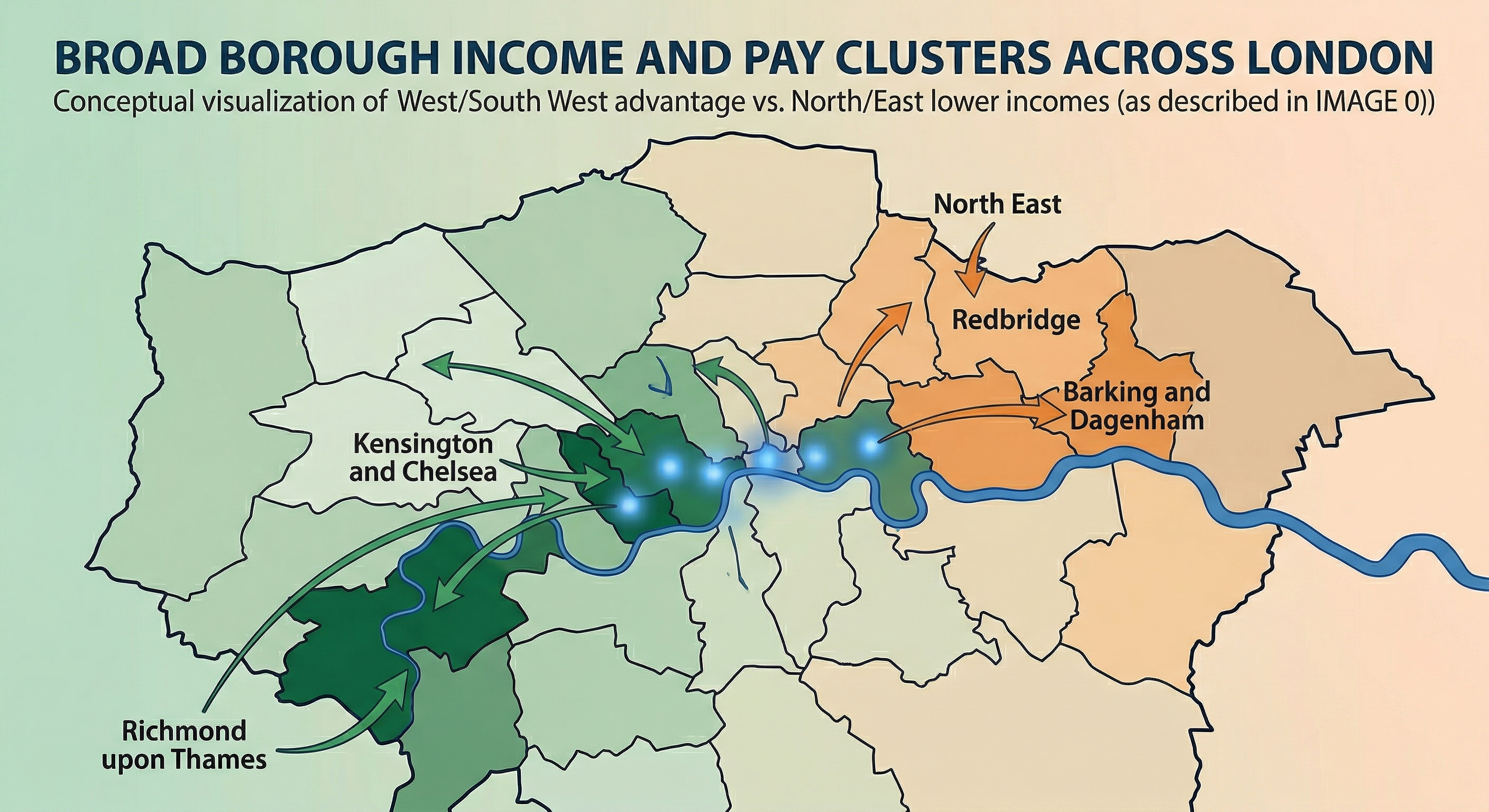
At a broad level, the higher-paid and higher-income parts of London still lean toward West and South West London, while many lower-income boroughs are concentrated in North and East London.
Trust for London says eight of the ten boroughs with the highest average household incomes are in South West or West London, while eight of the ten lowest are in North or East London.
That pattern is useful, but it is not the whole story. Even very affluent boroughs contain much poorer neighbourhoods, and even lower-ranked boroughs can have pockets of stronger earnings or lower housing pressure.
The right way to read an at-a-glance borough pay section is as orientation, not a final verdict. The deeper question is how the measurement itself changes the story.
The Measurement Issue Most Articles Miss
This is the section that saves readers from drawing the wrong conclusion from a perfectly real number. Most confusion around London borough salaries starts here.
Workplace Earnings Vs Place Of Residence Earnings
The main borough table above uses 2025 workplace annual median pay, because that is the latest complete borough data I could verify directly.
That makes it excellent for showing where higher-paid jobs are concentrated, but it does not answer the separate question of what people living in each borough typically earn. For that, you need the residence-based series, and the borough-formatted London file currently runs to 2024.
That distinction is not academic. ONS’s 2025 housing-affordability bulletin notes that workplace-based earnings are lower than residence-based earnings in most local authorities, and places with strong commuter patterns can show especially large gaps between what residents earn and what local jobs pay. Richmond upon Thames is one example cited by ONS.
Household Income Is Not The Same As Salary
Household income is broader than pay from one job. Trust for London’s borough-level income view uses average gross household income, which captures the resources flowing into households, not the earnings of a single employee.
That is why the richest borough and the highest salary borough are not interchangeable phrases. Richmond can lead on household income, while a different borough can dominate a workplace-pay table.
What Ashe Includes And Excludes
ASHE is the backbone of most official borough earnings comparisons, so it matters to know what it is measuring.
The London Datastore says ASHE is based on employer returns matched to HMRC PAYE records and covers employees on adult rates whose pay was not affected by absence in the reference period.
Self-employed Workers
ASHE does not cover the self-employed. That means borough earnings tables built on ASHE are employee-pay measures, not a full picture of all working adults or all income sources.
Suppressed Values And Confidence
The London Datastore also warns that some figures are suppressed as statistically unreliable and publishes coefficients of variation to show uncertainty. In plain English, not every borough-year figure is equally robust.
Full-time Vs All Workers
A full-time earnings figure will usually sit above an all-employee figure because it excludes many part-time roles.
If you compare a full-time annual number in one source with an all-employee hourly number in another, you are not comparing like with like.
Once you understand the measurement rules, borough salary data becomes far more useful and far less misleading. That sets up the next question: why are the borough differences so big in the first place?
Why Does The Borough Pay Differ So Much Across London

This is where the numbers start to feel like London rather than a spreadsheet. Borough pay is shaped by geography, commuting, industry mix, and the housing market.
Inner London Vs Outer London Patterns
Inner London often carries the city’s densest cluster of high-value jobs, while several outer boroughs look stronger on resident earnings or household income because of commuter patterns, family housing, and wealth concentration.
Trust for London’s income map shows a broad west/south-west advantage on household income, but also sharp within-borough inequality.
Commuting And Job Clustering In Central Boroughs
Central boroughs do not just contain more jobs; they contain more jobs in sectors that pay well. That is why workplace earnings can surge in boroughs with major office concentrations even when residents are not the same population earning those wages.
ONS’s affordability bulletin highlights that commuter-heavy authorities can show higher residence-based earnings than workplace-based earnings.
Expert Lens:When I compare borough salary tables, I start with one question: Does this figure follow the worker, the workplace, or the household? That one distinction explains most of the apparent contradictions readers notice on first pass.
Why A High Salary Does Not Always Mean Easy To Live There
Kensington and Chelsea offer a sharp example. It showed the highest resident median hourly earnings in the Mayor’s 2020 borough answer, yet ONS’s latest local housing page puts its average house price at £1,198,000 in January 2026 and average private rent at £3,628 a month in February 2026.
Barking and Dagenham sat at the low end of the 2020 resident-pay range, but its average house price was £360,000 in January 2026, and average private rent was £1,684 in February 2026.
So a higher-pay borough can still be harder to live in if housing costs absorb the advantage. That is why salary rankings alone do not answer the question of where I should live. question.
Real Pay Change Since 2008 And What That Adds To The Story
GLA Economics adds another layer: the boroughs with high nominal pay are not always the places where people have felt genuine progress.
Its 2024 analysis says only Newham and Lambeth saw growth in real average pay since 2008, while some high-pay boroughs, including Hammersmith and Fulham and Westminster, saw large real-pay declines.
That is a good reminder that top of the table does not necessarily mean moving ahead fastest. The next step is to translate pay into affordability, because that is where most readers actually need help.
Average Salary In London By Borough In Real-Life Affordability Terms
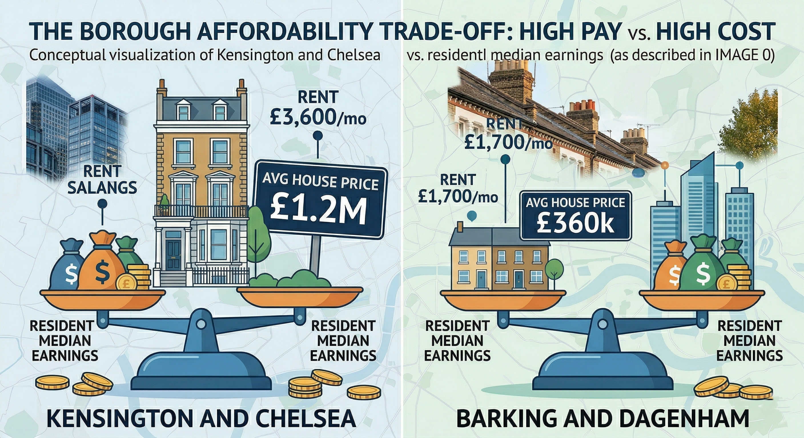
Rent affordability by London boroughbecomes useful when it helps you judge what life might cost around it. That means pairing pay with housing, low pay, and living-standard thresholds.
House Price-To-Earnings Pressure
ONS publishes borough-level affordability ratios built by dividing house prices by residence-based earnings.
At the regional level, London had the highest affordability ratio in England and Wales in 2025, with homes selling for 10.6 times average earnings.
That is the right official framework for judging whether a borough's salary goes far enough for home buying. A higher wage in a very expensive borough may still buy less housing power than a lower wage in a cheaper borough.
Low Pay And The London Living Wage
Trust for London’s 2025 borough data shows low pay is not evenly spread across the capital. It also shows that part-time jobs are significantly more likely to be low-paid than full-time jobs, and that women’s low-pay rates run above men’s on average across London.
That matters because borough average salary figures can hide a large low-pay tail. A borough can show a respectable median and still contain many residents in insecure or low-paid work.
Minimum Income Standard And What A Good Salary Really Depends On
Trust for London’s latest Minimum Income Standard research says a single adult in Inner London needs about £54.4k a year for a minimum acceptable living standard, versus £30.5k in the rest of the urban UK. It also says almost half of Londoners do not reach that threshold.
That is why the internet’s favourite salary questions can feel slippery. £40,000 may be workable for a sharer or someone with lower housing costs, but it is tight for many single renters in pricier boroughs.
£70,000 is strong by London standards, yet it does not cancel out high rent, childcare, or a costly mortgage on its own.
Practical lesson:A borough pay table helps most when it is read alongside the cost structure attached to that borough. The next section turns that into decision-ready examples.
Worked Examples That Make The Borough Data Usable
Readers rarely search this topic for trivia. They search for it because they are trying to make a choice, even if they do not phrase it that way.
Illustrative Scenario: A Single Renter Comparing Two Borough Paths
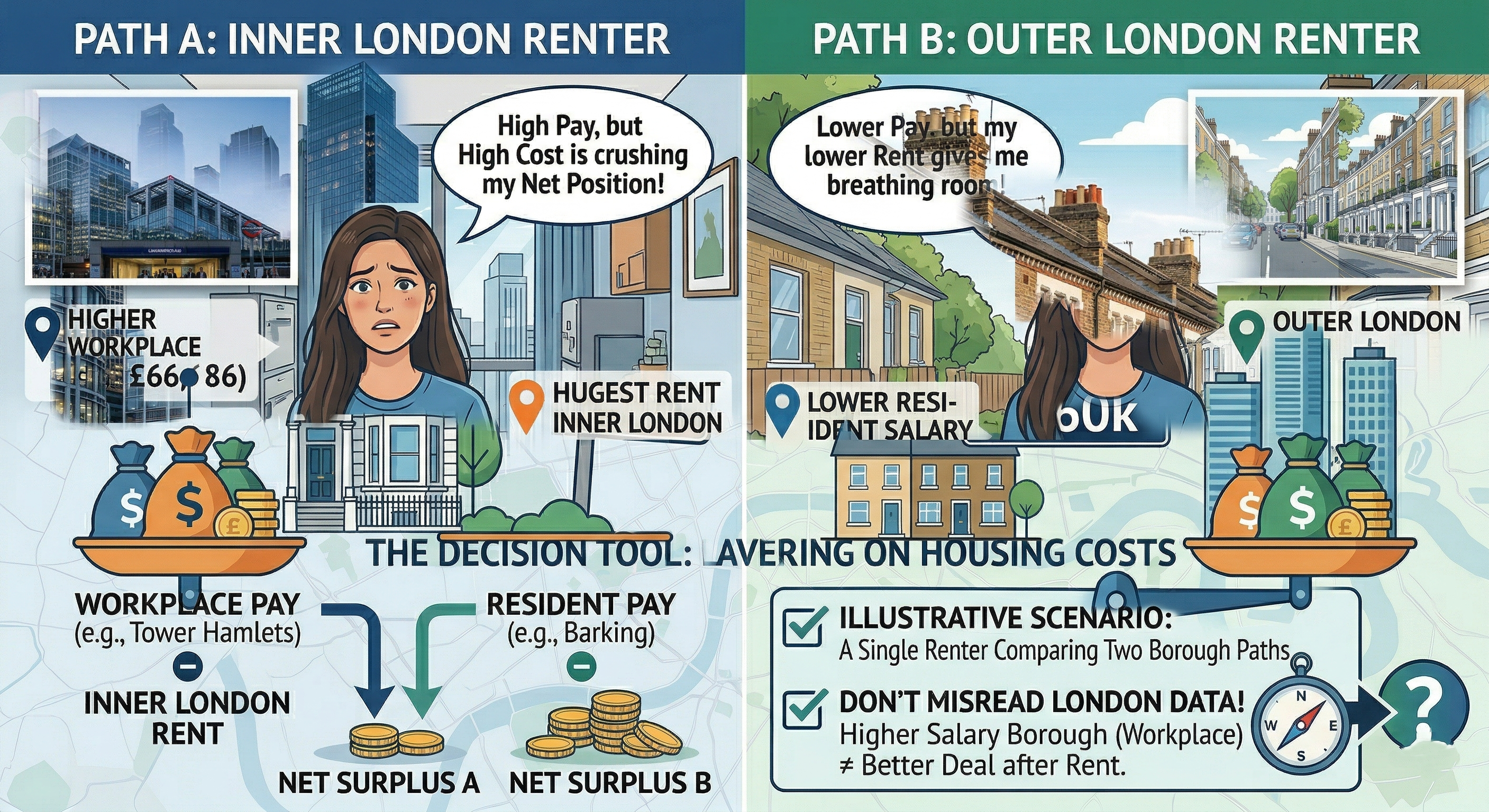
A single renter, Maya, is weighing two offers. One keeps her close to a higher-paying central-west part of London; the other points her toward a cheaper east-London base with a longer commute.
The first path may look better on a headline pay table, but the housing pages tell a harsher story: Kensington and Chelsea’s average rent was £3,628 a month in February 2026, while Barking and Dagenham’s was £1,684.
Worked Example: If Maya gains a few hundred pounds a month in gross pay but gives up nearly £2,000 a month on rent, the higher-paying borough is not automatically the better deal. Borough salary data is useful only after housing is layered on top.
Illustrative Scenario: A Commuter Weighing Salary Against Rent And Travel
A second reader, Daniel, lives in a borough with stronger resident earnings but works in a different borough with stronger workplace pay.
That is normal in London. ONS explicitly notes that commuter-heavy authorities can show residents earning more than local workers, which is one reason borough rankings can look contradictory at first glance.
For Daniel, the right comparison is not which borough is richer? But what will my net monthly position look like after housing and travel? Borough tables narrow the search; they do not finish the calculation.
Common Mistakes People Make When Comparing Borough Salary Data
- Mixing workplace and residence earnings as if they were the same thing.
- Using the mean instead of the median for typical pay.
- Treating household income as if it were one worker’s salary.
- Ignoring that ASHE excludes the self-employed.
- Assuming a high-pay borough must also be easy to rent or buy in.
The point of worked examples is not to personalise the data beyond recognition. It is to show how a borough's pay number becomes a usable decision once the missing context is added.
How To Use Borough Salary Data For Better Decisions
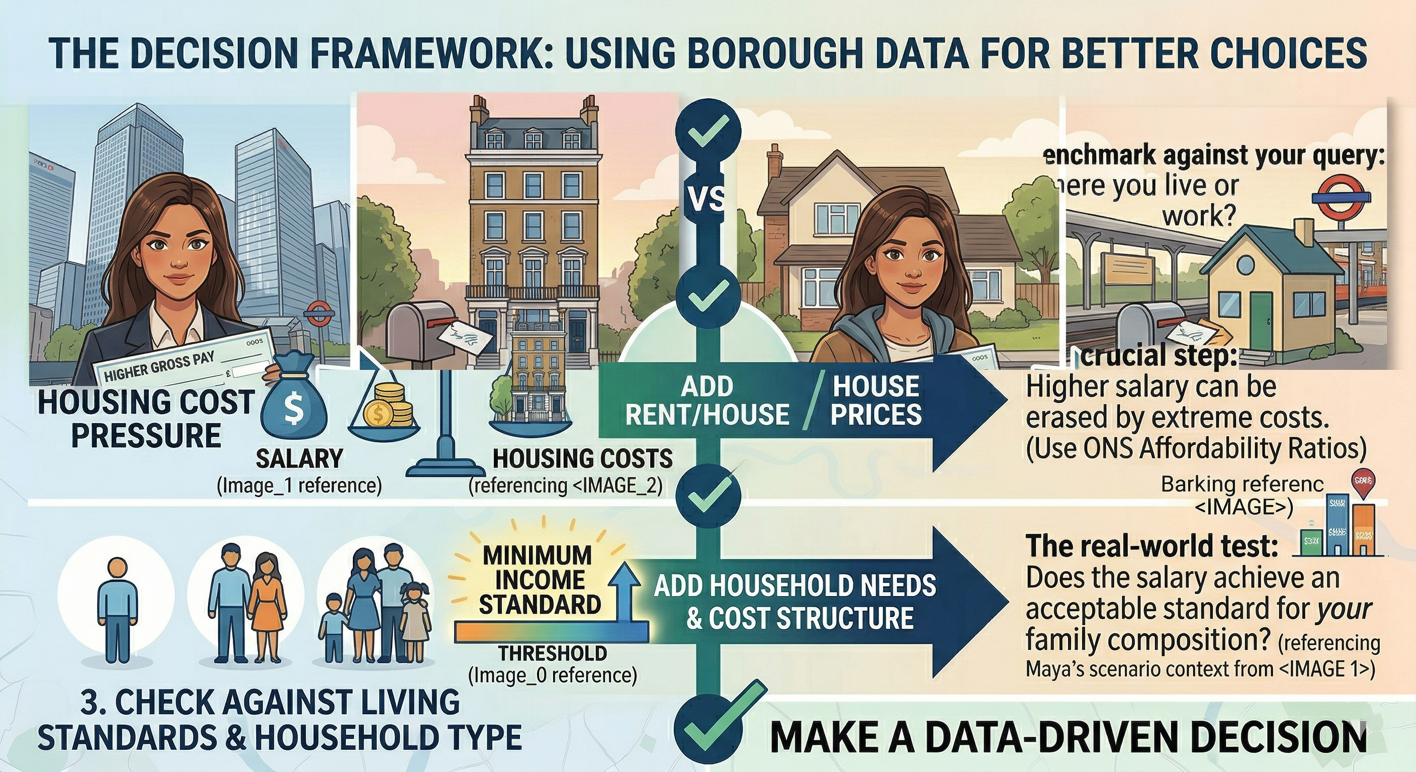
This section turns the analysis into a repeatable method. If you use borough salary data with the right sequence, it becomes far more reliable.
If You Are Choosing Where To Live
Use this order:
- Start with resident earnings, not workplace earnings.
- Pair that with rent or house-price pressure, ideally using ONS affordability ratios or local price pages.
- Add a living-standard check, such as the Minimum Income Standard.
If You Are Evaluating A Job Offer
Ask two questions before you trust the headline salary. First, is the role located in a borough where workplace pay is inflated by sector clustering? Second, what does that salary look like after the housing costs of the area you actually plan to live in?
If You Are Benchmarking Pay For Research, Hiring, Or Content
Use median as the default, label the year, state whether the figure is workplace or residence-based, and avoid comparing a borough's salary directly with a household-income statistic. That one discipline will make your analysis cleaner than much of what currently ranks for this topic.
A short checklist beats a long table every time: pick the right measure, attach the year, then test it against housing and household costs. That leaves only the common reader questions, which are worth answering directly.
Also Read: Most Popular Baby Names In London
Frequently Asked Questions
These are the questions readers usually ask after seeing the first borough table. The short answers below stay close to the official evidence and avoid mixing measures.
What Is The Average Salary In London By Borough?
There is no single borough figure that answers every version of that question. Official sources publish residence earnings, workplace earnings, and household income separately, and each tells a different story.
Which Borough Has The Highest Average Salary?
It depends on the dataset. In the Mayor’s borough wage answer using resident hourly earnings for 2020, Kensington and Chelsea was the highest, but a workplace-based table or a household-income table can point somewhere else.
Which Borough Has The Lowest Average Salary?
That also depends on the metric. In the same 2020 resident hourly earnings range cited by the Mayor, Barking and Dagenham was the lowest at £13.10 an hour.
Is Salary Measured By Where People Work Or Where They Live?
Both measures exist. Workplace earnings follow the job’s location, while residence earnings follow where the employee lives.
Should I Use The Median Or The Mean Salary?
Use the median unless you have a strong reason not to. ONS says the median is the preferred measure because it is less distorted by very high earners.
Which Is The Richest Borough In London?
If you mean average gross household income, Trust for London’s latest borough view shows Richmond upon Thames at the top, at around £101,973 in 2022/23.
Is £40,000 A Good Salary In London?
It can be workable, but it is not generous by default. Trust for London’s Minimum Income Standard shows how quickly rent and household type change what counts as enough.
Is £70,000 A Good Salary In London?
For many single earners, yes, it is a strong salary. But it still needs to be tested against housing, childcare, commuting, and the borough cost structure around your actual life.
What Is A Top 10% Salary In London?
Borough average tables cannot answer that precisely. For the broader UK context, ONS classed jobs paid above £26.94 an hour in April 2025 as high-paid, but that is not the same thing as a London top-decile cut-off.
Does The Data Include Self-Employed Workers?
No. ASHE-based borough earnings tables do not cover the self-employed.
The fast answers are useful, but the durable answer is this: borough salary data works best when you keep the measure, year, and housing context in the same frame.
Conclusion
The value of this topic is not in naming one best-paid borough and stopping there. It is in understanding why London keeps producing different answers to the same salary question, and how to choose the answer that actually matches your life.
If the question is where residents tend to earn more, start with residence-based median pay. If the question is where the jobs pay more, use workplace earnings. If the question is which boroughs are richer overall, use household income.
Then pressure-test all of it against housing and the Minimum Income Standard before calling any salary good.
London rewards precision. The closer your question is to the right metric, the more useful the borough salary data becomes.
Also Check Out:Best Bed Bug Treatment Companies In London
Jump to
Average Salary In London By Borough: Which Areas Pay More And Why
How To Read This Page
Quick Facts Readers Usually Want First
The Quick Answer On The London Borough Pay
Average Salary In London By Borough At A Glance
The Measurement Issue Most Articles Miss
Why Does The Borough Pay Differ So Much Across London
Average Salary In London By Borough In Real-Life Affordability Terms
Worked Examples That Make The Borough Data Usable
How To Use Borough Salary Data For Better Decisions
Frequently Asked Questions
Conclusion

James Rowley
Author
James Rowley is a London-based writer and researcher covering London life, cultural geography, London travel, live London webcam pages and selected public figures across entertainment, sport, business and public life.
For over 15 years, he has focused on verified sources, first-hand local context and clear explanations that help readers understand both places and people more deeply. His work combines street-level London knowledge with careful research into career credits, media work, business interests and, where relevant, transparently explained net worth estimates.
He writes and reviews articles published on LondonWebcam.
Latest Articles
Popular Articles