Poorest Boroughs In London: Income, Child Poverty & Deprivation
Find the poorest boroughs in London using poverty after housing costs, child poverty and deprivation data, without misleading stereotypes.
Author:James RowleyMay 11, 20262.6K Shares70.9K Views
Poorest Boroughs In London: Why The Ranking Depends On The Metric
By the latest income deprivation data, the poorest London boroughs include Tower Hamlets, Hackney, Newham, Barking and Dagenham, Enfield and Brent. By child poverty after housing costs, Tower Hamlets, Hackney and Newham rank highest. By poverty after housing costs, the list broadens to include Camden, Westminster, Hounslow, Redbridge and Ealing.
That distinction matters. A borough can have high house prices and still have high poverty. It can contain wealthy streets and deprived neighbourhoods within the same boundary. So the most accurate answer is not just a list of “poor boroughs”; it is a ranking that clearly states what is being measured, which year the data comes from, and what the data does not prove.
Poorest Boroughs In London: The Short Answer
If you want the quickest answer, start here. The poorest boroughs in Londondepend on the chosen metric, but several boroughs appear repeatedly across the latest poverty and deprivation data.
Key Takeaways Before The Ranking
- By income deprivation, Tower Hamlets, Hackney, Newham, Barking and Dagenham, Enfield and Brent are among the most affected London boroughs.
- By poverty after housing costs, Camden, Westminster, Tower Hamlets, Newham, Hounslow, Redbridge, Brent, Barking and Dagenham, Enfield and Ealing have poverty rates higher than the London average.
- By child poverty after housing costs, Tower Hamlets and Hackney stand out, with around half of children in poverty.
- By multiple deprivation, there is no single borough winner: Newham, Hackney, Haringey and Brent each rank highest depending on the summary measure used.
- Borough averages hide internal inequality.A borough can include affluent homes, social housing, expensive rental markets and severe neighbourhood deprivation at the same time.
The most useful answer is therefore: Tower Hamlets, Hackney, Newham, Barking and Dagenham, Enfield and Brent are the main boroughs to examine first, but the ranking must always name the metric.
What “poorest Boroughs” Means In This Article
Here, “poorest” means boroughs that rank highly on poverty, income deprivation, child poverty or deprivation measures. It is not a judgement about residents, culture, safety or the overall worth of a place.
The term is used because it is the phrase many people search for, but the article treats it as a data question. That means each ranking must answer three things clearly:
- What is the metric?
- Which borough ranks highest or lowest on that metric?
- What caveats stop the ranking from being misread?
Ranked Boroughs And The Metric Used
| Ranking detail | Metric, year and source |
| Tower Hamlets, Hackney, Newham, Barking and Dagenham, Enfield and Brent rank highly for income deprivation. | English Indices of Deprivation 2025, Income Deprivation Domain. |
| Camden, Westminster, Tower Hamlets, Newham, Hounslow, Redbridge, Brent, Barking and Dagenham, Enfield and Ealing are above the London average for poverty after housing costs. | Trust for London borough poverty indicator 2025. |
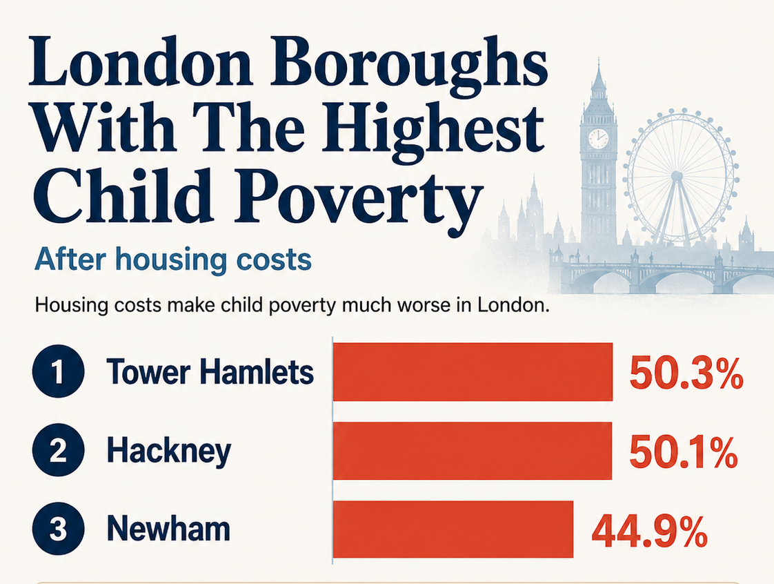
| Tower Hamlets, Hackney and Newham are the highest local authorities for child poverty in the Child Poverty Action Plan for London. | Child poverty after housing costs: Tower Hamlets 50.3%, Hackney 50.1%, Newham 44.9%, 2026. |
| Newham, Hackney, Haringey and Brent each rank highest on different IMD summary measures. | OCSI analysis of the English Indices of Deprivation 2025. |
Which Metric Should You Use?
| Goal | Best metric |
| Quick borough poverty comparison | Poverty after housing costs |
| Low-income household ranking | Income Deprivation Domain |
| Family/children focus | Child poverty after housing costs |
| Wider disadvantage | Index of Multiple Deprivation |
| Neighbourhood-level hotspots | LSOA/IMD data |
What The Data Says And What It Does Not Say
Poverty and deprivation data can show where financial pressure is higher across London, but it should not be treated as a label for everyone in a borough.
The data can show:
- where more households are on low incomes
- where poverty is higher after rent and housing costs
- where child poverty is more common
- where deprivation is concentrated in particular neighbourhoods
But it cannot prove that:
- every household in a borough is poor
- a borough is unsafe
- one neighbourhood represents the whole borough
- high house prices mean low poverty
- cheaper housing always means less hardship
Similarly, data on London boroughs with the highest paycan show where earnings are strongest, but it does not automatically prove that poverty is low once housing costs and household size are considered.
Things Readers Should Not Infer From The List
- Do not infer that every resident in a listed borough is poor.
- Do not infer that poverty data is a crime or safety ranking.
- Do not infer that expensive boroughs have no poverty.
- Do not infer that cheaper housing always means less hardship.
- Do not infer that one street, estate or town centre represents the whole borough.
The useful question is not “which borough deserves the label poorest?” The useful question is “which metric best answers what I am trying to understand?”
What Does “poorest Borough” Actually Mean?
There is no single official meaning of “poorest borough.” In this article, the phrase refers to boroughs that rank highly on poverty, income deprivation, child poverty or wider deprivation measures.
These terms are related, but they do not mean exactly the same thing:
| Term | What it means |
| Poverty after housing costs | Household income is measured after rent, mortgage interest and housing costs are counted. This is especially useful in London because housing costs are so high. |
| Income deprivation | Which boroughs have the largest share of people living in low-income households. |
| Child poverty | Which boroughs have the highest share of children living in poverty. |
| Multiple deprivation | Which areas face wider disadvantage across income, work, health, education, crime, housing and living conditions. |
This distinction matters because London boroughs are mixed places. A borough can have expensive homes, new developments and wealthy households while still containing many residents in poverty. Borough-level rankings are useful starting points, but neighbourhood-level data often gives the sharper picture.
The Poorest Boroughs In London By Income Deprivation
Income deprivation is one of the strongest metrics for a direct borough ranking. It focuses on low-income households and gives a clearer answer than house prices or reputation.
1. Tower Hamlets
Tower Hamlets ranks second nationally on the Income Deprivation Domain, with 40.1% of the population living in income-deprived households.
That makes Tower Hamlets one of the strongest answers when someone asks which London borough is poorest by income deprivation.
2. Hackney
Hackney ranks third nationally, with 40.0% of the population living in income-deprived households.
Hackney also shows why London rankings can feel counterintuitive. A borough can experience visible regeneration and still contain severe income deprivation.
3. Newham
Newham ranks fourth nationally, with 39.0% of the population living in income-deprived households.
OCSI also identifies Newham as the most deprived London borough by average rank, which reflects consistently high deprivation across the borough.
4. Barking And Dagenham
Barking and Dagenham ranks fifth nationally for income deprivation, with 38.4% of the population living in income-deprived households.This matters because poverty pressure is not only an inner-London story. Outer London boroughs can experience serious low-income pressure too.
5. Enfield
Enfield ranks sixth nationally for income deprivation, with 37.7% of the population living in income-deprived households.
This makes Enfield one of the clearest examples of outer London poverty pressure. It also sits within the wider north and north-east London deprivation pattern, where housing costs, low income and neighbourhood inequality can overlap.
6. Brent
Brent ranks twelfth nationally for income deprivation, with 36.7% of the population living in income-deprived households.
Brent is especially important because it also stands out on local concentration measures. In simple terms, some of its most deprived neighbourhoods are intensely deprived, even though the borough as a whole is socially and economically mixed.
The Poorest Boroughs In London By Poverty Rate After Housing Costs
Poverty after housing costs is one of the most useful measures for London because rent and housing costs are such a large part of household pressure. It answers a different question from income deprivation: which boroughs have higher poverty rates once housing costs are counted?
Boroughs Above The London Average
Trust for Londonidentifies Camden, Westminster, Tower Hamlets, Newham, Hounslow, Redbridge, Brent, Barking and Dagenham, Enfield and Ealing as boroughs with poverty rates higher than the London average.
This list differs from the income deprivation ranking because the measure is different. That is not a contradiction; it is exactly why the metric must be stated.
Why Camden And Westminster Can Appear High Despite Wealthy Areas
Camden and Westminster show why poverty and wealth can exist side by side. Both boroughs contain high-value property, major employers and affluent households, but they also contain households facing poverty after housing costs.
The common mistake is to assume high property values cancel out poverty. House prices measure the property market. Poverty measures household resources.
This is also why a borough can appear in discussions of the richest boroughs in Londonwhile still having residents in poverty after housing costs.
Why Housing Costs Change The Ranking
Trust for London’s borough poverty measure is after housing costs, and its methodology notes that the indicator uses a five-year pooled sample with 2020/21 excluded because of sample bias concerns.
This is why London poverty analysis should almost always ask whether the figure is before or after housing costs. A before-housing-cost ranking can understate the pressure facing renters and families in expensive boroughs.
For readers comparing poverty with everyday expenses, it is also worth looking at the wider cost of living in London, because rent, transport, childcare and bills can change how far income actually goes.
The Poorest Boroughs In London For Child Poverty
Child poverty is one of the most important measures because it shows where household hardship affects children after housing costs are counted.
Tower Hamlets And Hackney
Trust for London says that in Tower Hamlets and Hackney, half of children are in poverty after housing costs. It also notes that in Tower Hamlets, 27% of children are in poverty before housing costs, rising to 50% after housing costs.
The Child Poverty Action Plan for London gives precise headline figures: Tower Hamlets at 50.3%, Hackney at 50.1% and Newham at 44.9%.
Newham, Islington, Barking And Dagenham, Camden And Brent
Newham is the next major borough after Tower Hamlets and Hackney in the Child Poverty Action Plan figures, at 44.9%.
Trust for London’s child poverty data also shows large borough differences across the capital. For example, it compares Tower Hamlets and Hackney at 50% with Bromley at 15%, and Hounslow at 32% with neighbouring Richmond at 11%.
Why Child Poverty After Housing Costs Is Especially Severe In London
Housing costs are the key reason child poverty looks worse after costs are counted. Trust for London states that accounting for housing costs raises Tower Hamlets’ child poverty figure from 27% to 50%, and that child poverty at least doubles in 21 of 33 boroughs when housing costs are included.
That is why after-housing-cost child poverty is one of the most important measures for London.
Why Different London Borough Rankings Disagree
Different London borough rankings disagree because they measure different things. One list may rank boroughs by income deprivation, another by poverty after housing costs, another by child poverty, and another by the Index of Multiple Deprivation.
That is why Newham, Hackney, Haringey and Brent can each appear as the “most deprived” depending on the summary measure used. For example, Newham may rank highest by average deprivation across the borough, while Brent can stand out because some of its most deprived neighbourhoods are especially concentrated.
Income deprivation is narrower because it focuses on low-income households. The Index of Multiple Deprivation is broader because it also includes employment, education, health, crime, housing barriers and living environment.
London’s Deprivation Geography: Not Just One Side Of The City
London’s poverty map is not limited to one side of the city. East London is prominent, but deprivation also appears in parts of north, west and south London.
East London And The River Lea Corridor
The London Datastore describes a crescent-shaped pattern of multiple deprivation beginning in eastern Enfield, running through Haringey and Hackney, and continuing into Tower Hamlets, Newham and Barking and Dagenham.
OCSI also identifies clusters along the River Lea corridor and across East London from Whitechapel through Stratford to Barking.
North And North-West London Pockets
North and north-west London include important deprivation pockets. OCSI highlights parts of Brent, including Neasden, Willesden and Harlesden, as notable areas in the deprivation geography.
This is why “East London is poor, West London is rich” is too blunt.
West London Housing-pressure Boroughs
West London can show deprivation through housing pressure and affordability, even where property values are high. The London Datastoreidentifies additional hotspots of higher multiple deprivation in Brent, Ealing and Hounslow.
Trust for London also lists Hounslow, Ealing and Brent among boroughs above the London average for poverty after housing costs.
South London Deprivation Pockets
South London also has deprivation pockets. The London Datastore identifies Lewisham and Greenwich as additional hotspots of higher multiple deprivation.
The practical point is that poverty is not confined to one compass point. London’s deprivation map is layered, local and strongly shaped by housing pressure.
Borough-by-borough Comparison Table
This comparison gives a quick way to read the borough signals without pretending that one table can settle every question. Use it as a starting point, then check the metric that matches your purpose.
| Borough signal | What the data suggests |
| Tower Hamlets | One of the clearest headline boroughs for income deprivation and child poverty. It ranks second nationally for income deprivation at 40.1%, and child poverty after housing costs is around 50%. |
| Hackney | Very high on income deprivation and child poverty. It ranks third nationally for income deprivation at 40.0%, and child poverty after housing costs is around 50%. |
| Newham | High income deprivation and broad deprivation. It ranks fourth nationally for income deprivation at 39.0%, and OCSI ranks it most deprived by average rank. |
| Barking and Dagenham | High income deprivation and part of London’s eastern deprivation pattern. It ranks fifth nationally for income deprivation at 38.4%. |
| Enfield | High income deprivation and part of the eastern Enfield/River Lea deprivation pattern. It ranks sixth nationally for income deprivation at 37.7%. |
| Brent | High income deprivation and strong local concentration of deprivation. Brent shows why neighbourhood hotspots matter. |
| Camden and Westminster | Above the London average for poverty after housing costs despite visible wealth and high-value property markets. |
| Hounslow and Ealing | Above the London average for poverty after housing costs and part of West London’s deprivation geography. |
The table is best read as a metric map, not a stigma map.
Methodology And Sources
This article compares London boroughs using four measures: poverty after housing costs, income deprivation, child poverty and multiple deprivation. The main sources are Trust for London, GOV.UK’s English Indices of Deprivation 2025, OCSI, London Datastore and the Child Poverty Action Plan for London.
These sources do not all measure the same thing, so the article does not treat one borough as the single “poorest” in every sense. Instead, it explains which boroughs rank highest depending on the metric used.
Last reviewed: 2026. Poverty, deprivation and housing-cost data can change, so readers should check the latest source release before using figures for policy, research or publication.
Frequently Asked Questions
Which Borough Is The Poorest In London?
There is no single official answer. By income deprivation, Tower Hamlets, Hackney and Newham rank extremely high. By child poverty after housing costs, Tower Hamlets and Hackney stand out.
How Is Poverty Measured?
Trust for London defines borough poverty as household income below 60% of median household income after housing costs, using a five-year pooled sample.
Are Poorer Boroughs Always Cheaper To Live In?
No. London boroughs with high poverty can also have expensive housing. Camden and Westminster are above the London average for poverty after housing costs, despite containing high-value property markets.
Why Do Borough Averages Hide Internal Inequality?
A borough average combines very different neighbourhoods. Affluent streets, deprived estates, private renters, social housing tenants and high-income homeowners can all sit inside one borough boundary.
Which Borough Ranks Highest Or Lowest On The Chosen Metric?
It depends on the metric. Tower Hamlets ranks very high for income deprivation and child poverty, while OCSI identifies Newham, Hackney, Haringey and Brent as highest on different IMD summary measures.
How Is The Metric Defined?
Income deprivation measures low-income households. Child poverty measures children in low-income households. IMD combines several deprivation domains, including income, employment, education, health, crime, housing barriers and living environment.
What Caveats Matter?
Check the year, source, metric, housing-cost treatment and geography. Borough rankings are useful signals, but they cannot describe every household or every neighbourhood.
Why Do Different London Rankings Disagree?
They disagree because poverty rate, income deprivation, child poverty, IMD average rank, IMD average score and local concentration measure different forms of disadvantage.
Where Do The Poorest People Live In London?
Poverty is spread across London but concentrated in certain boroughs and neighbourhoods. East London is prominent, but Brent, Enfield, Hounslow, Ealing, Lewisham and Greenwich also matter.
Which Of The Five Boroughs Is The Poorest?
London does not have five boroughs; that wording usually refers to New York City. London has 32 boroughs plus the City of London.
Conclusion
The most accurate answer is not “one borough is definitely the poorest.” The better answer is: the poorest boroughs in London depend on the metric used.
If you mean income deprivation, Tower Hamlets, Hackney, Newham, Barking and Dagenham, Enfield and Brent are central to the answer. If you mean child poverty after housing costs, Tower Hamlets, Hackney and Newham are the headline boroughs.
If you mean poverty after housing costs, the list broadens to include boroughs such as Camden, Westminster, Hounslow, Redbridge, Ealing and others above the London average.
Jump to
Poorest Boroughs In London: Why The Ranking Depends On The Metric
Poorest Boroughs In London: The Short Answer
What Does “poorest Borough” Actually Mean?
The Poorest Boroughs In London By Income Deprivation
The Poorest Boroughs In London By Poverty Rate After Housing Costs
The Poorest Boroughs In London For Child Poverty
Why Different London Borough Rankings Disagree
London’s Deprivation Geography: Not Just One Side Of The City
Borough-by-borough Comparison Table
Methodology And Sources
Frequently Asked Questions
Conclusion

James Rowley
Author
James Rowley is a London-based writer and researcher covering London life, cultural geography, London travel, live London webcam pages and selected public figures across entertainment, sport, business and public life.
For over 15 years, he has focused on verified sources, first-hand local context and clear explanations that help readers understand both places and people more deeply. His work combines street-level London knowledge with careful research into career credits, media work, business interests and, where relevant, transparently explained net worth estimates.
He writes and reviews articles published on LondonWebcam.
Latest Articles
Popular Articles