London Boroughs With The Lowest Pay: What Data Shows
London Boroughs with the Lowest Pay can vary by measure. See which boroughs stand out by residents, workplaces, earnings, and living costs.
Author:James RowleyMay 15, 20267.1K Shares123.7K Views
London Boroughs With The Lowest Pay And What The Figures Mean
The London borough with the “lowest pay” depends on the measure: Barking and Dagenham and Brent stand out for low-paid residents, while Redbridge stands out for low-paid jobs located in the borough.
That distinction matters. A borough can have many low-paid residents who commute elsewhere, many low-paid jobs filled by people from outside the borough, or relatively low median weekly earnings among employees working there. Treating all three as the same thing is the quickest way to misread London pay data.
Important data note:Trust for London’s 2025 borough low-pay estimatesuse the London Living Wage rate in force when the Annual Survey of Hours and Earnings was collected in April 2025: £13.85.
The newer 2025/26 London Living Wage rate is £14.80, announced in October 2025. So this article separates the wage threshold used in the data from the current London Living Wage rate.
This article focuses mainly on London borough comparisons. Some official earnings datasets also include the City of London as a separate local authority, which can affect highest-pay rankings.
In Short: Key Takeaways
- There is no single “lowest-paid borough” unless you define the metric first.
- Barking and Dagenham and Brent have just under a quarter of working residents in low-paid jobs. Data as of January 2026.
- Redbridge stands out by workplace low pay, with around a third of jobs below the London Living Wage. Data as of January 2026.
- The London Living Wage is £14.80 per hour for 2025/26. Data as of October 2025.
- Low pay is not the same as poverty, low household income, or cheap rent.
- The quickest way to use this data correctly is to ask: am I looking at where low-paid workers live, where low-paid jobs are based, or what typical workplace earnings are?
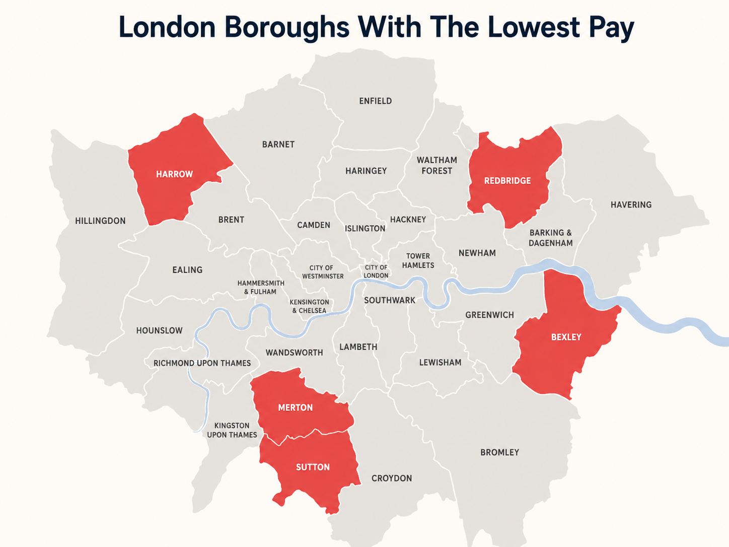
Quick Table: Lowest Median Weekly Workplace Earnings
These figures show median weekly workplace earnings, not poverty, household income, rent affordability, or the pay of every resident living in the borough.
| Borough | Estimated median weekly workplace earnings |
| Redbridge | £710.60 |
| Bexley | £718.50 |
| Merton | £747.00 |
| Harrow | £757.30 |
| Sutton | £764.10 |
For the opposite end of the earnings picture, see our guide to London Boroughs With The Highest Pay.
What “Lowest Pay” Means In London
This section gives you the vocabulary to read the rankings properly. Once you know the difference between pay, income, poverty, and affordability, the borough data becomes much clearer.
Low Pay Vs Low Income Vs Poverty
Low pay usually refers to a job paying below a wage threshold, such as the London Living Wage. Trust for London’s borough low-pay measure looks at the proportion of borough residents’ jobs paid below the London Living Wage, using Annual Survey of Hours and Earnings data from ONS via Nomis. Data as of January 2026.
Low income is broader. It looks at household income, which may include earnings from several people, benefits, pensions, or other income. Trust for London’s household income data shows average gross household income ranging from around £64,000 in Brent to around £102,000 in Richmond upon Thames. Data as of April 2026, based on 2022/23 income estimates.
Povertyis broader again. Trust for London defines borough poverty as living below 60% of median household income after housing costs, using pooled survey data because borough-level samples can be small. Data as of June 2025.
The takeaway: low pay is about jobs, low income is about households, and poverty is about whether income is enough after costs.
London Living Wage Vs National Living Wage Vs Minimum Wage
The London Living Wage is voluntary. It is calculated to reflect the cost of living and is higher in London than the UK-wide real Living Wage. The 2025/26 London Living Wage is £14.80 per hour. Data as of October 2025.
The National Living Wage is the legal minimum for workers aged 21 and over. GOV.UK lists the April 2026 rate as £12.71 per hour for eligible workers aged 21 and over. Data as of April 2026.
So when a borough is described as having “low pay,” always check whether the source means below the London Living Wage, below the legal minimum, or simply below the London median.
Why Median Pay Is Better Than Average Pay For Borough Comparisons
Median pay is usually the better measure for borough comparisons because it shows the middle worker, not a number pulled upward by a small group of very high earners.
London Datastore explains that ONS headline earnings statistics use the median because it is less affected by very high earners and skewed pay distributions.
A common mistake is to compare boroughs using mean salary alone. In a city with finance, tech, hospitality, retail, care, cleaning, and public-sector work all sitting close together, the mean can make typical pay look higher than many workers actually experience.
For a wider pay comparison across the capital, see our guide to average salary in London by borough.
The next step is to separate the three main ranking lenses.
The Three Ways To Rank London Boroughs By Lowest Pay
This section is the core of the article. The same borough can look very different depending on whether you are measuring residents, jobs, or median earnings.
| Measure | What it tells you |
| Resident low pay | Where people who hold low-paid jobs live |
| Workplace low pay | Where low-paid jobs are located |
| Median weekly earnings | What the typical employee in that borough earns |
Which Measure Should You Use?
| If your question is | Use this measure |
| Where do low-paid London workers live? | Resident low pay |
| Where are low-paid jobs located? | Workplace low pay |
| What does a typical worker earn in a borough? | Median workplace earnings |
| Which boroughs have lower household resources? | Household income |
| Which boroughs face deeper hardship after housing costs? | Poverty after housing costs |
1. Resident Low Pay: Where Low-Paid Workers Live
Resident low pay looks at people who live in a borough, even if they work somewhere else. Trust for London’s resident indicator says it looks only at people living in a given borough, and their job may be located anywhere. Data as of January 2026.
This is the best lens if your question is: “Where do London’s low-paid workers live?”
2. Workplace Low Pay: Where Low-Paid Jobs Are Located
Workplace low pay looks at jobs based in a borough, even if the workers commute in from elsewhere. Trust for London’s workplace indicator explicitly says it focuses on jobs based in London and includes people who may live elsewhere but commute into the capital. Data as of January 2026.
This is the best lens if your question is: “Which boroughs contain the highest share of low-paid jobs?”
3. Median Weekly Earnings: What A Typical Worker Earns In That Borough
Median weekly earnings show typical gross pay among employees in the area being measured. London Datastore’s workplace earnings dataset includes annual median, mean, and lower-quartile earnings by borough, drawn from ASHE. Data to December 2025.
This is the best lens if your question is: “What does a typical employee earn in this borough?”
Methodology Limitations To Keep In Mind
- ASHE is survey-based, so borough-level figures can carry uncertainty.
- The self-employed are not covered in ASHE workplace earnings data.
- Resident and workplace data should not be mixed in the same ranking.
- Low-pay estimates use wage-distribution modelling, not a census of every payslip.
- Some borough poverty figures use pooled survey data to improve reliability.
- Suppressed or uncertain data points should not be over-interpreted.
Before quoting any ranking, check which question the data actually answers.
Lowest-Paid London Boroughs By Resident Low-Pay Prevalence
This section answers the most human version of the query: where are Londoners most likely to live while holding jobs paid below the London Living Wage?
Barking And Dagenham
Barking and Dagenham is one of the clearest boroughs to mention when discussing resident low pay. Trust for London reports that just under a quarter of working residents in Barking and Dagenham are low paid, and its page highlights 23% of working residents as low-paid. Data as of January 2026.
That does not mean Barking and Dagenham is a “bad borough.” It means a large share of employed residents are in jobs that fall below the London Living Wage threshold used in the analysis.
Brent
Brent also stands out in Trust for London’s resident low-pay analysis. The source states that in Barking and Dagenham and Brent, just under a quarter of working residents are low paid. Data as of January 2026.
Brent is also important because it appears in income data. Trust for London’s borough household income indicator shows Brent with the lowest average gross household income among London boroughs in its 2022/23 dataset. Data as of April 2026.
Enfield, Newham, Hounslow, Hillingdon, Ealing, Harrow, Sutton, And Bexley
These boroughs should be treated as a comparison set, not a single ordered ranking. They matter because they often appear across London conversations about resident pay, workplace pay, poverty, household income, or median earnings.
Newham is especially relevant for part-time resident low pay: Trust for London reports that more than half of Newham residents in part-time jobs are low paid. Data as of January 2026.
Hounslow, Redbridge, Brent, Barking and Dagenham, Enfield, and Ealing also appear in Trust for London’s group of boroughs with poverty rates higher than the London average. That reinforces why pay data should be read alongside housing and household-income data, not in isolation. Data as of June 2025.
What This Ranking Tells You - And What It Does Not
Resident low-pay data tells you where low-paid workers live. It does not tell you whether the jobs are in that borough, whether rents are low, or whether every household in that borough has low income.
The mistake I would avoid is treating this as a league table of borough quality. It is a labour-market signal, not a verdict on a place.
Do not conclude that:
- A low-paid borough is automatically unsafe.
- A low-paid borough is always cheap.
- Everyone living there is low-income.
- All jobs in that borough are low-paid.
- One ranking tells the whole story.
Next, the workplace view changes the picture.
Next, the workplace view changes the picture.
Lowest-Paid London Boroughs By Workplace Low-Pay Share
This section looks at the boroughs where low-paid jobs are located. It is especially useful for employers, local policymakers, and anyone studying the geography of London’s labour market.
Why Redbridge Stands Out
Redbridge is the headline borough under the workplace low-pay lens. Trust for London says that in Redbridge, a third of jobs are low-paid, using the London Living Wage threshold. Data as of January 2026.
This is different from saying Redbridge residents are all low paid. The workplace measure counts jobs located in Redbridge, including jobs held by people who may live outside the borough.
The Outer London Pattern
Trust for London notes a clear Inner London and Outer London divide in the proportion of workplace jobs paid below the London Living Wage. The boroughs with the highest proportions of low-paid jobs are all in Outer London, especially East London. Data as of January 2026.
One reason is industry mix. The same Trust for London source reports that accommodation and food service has a much higher low-pay share than finance and insurance, while retail also contributes a large number of low-paid jobs. Data as of January 2026.
Why Inner London Still Has Many Low-Paid Jobs
Inner London can have a lower proportion of low-paid jobs but still contain many low-paid roles because it has such a large job base. Trust for London gives Westminster as an example: around one in ten low-paid jobs in London are in Westminster despite its relatively small low-pay proportion. Data as of January 2026.
That is the core London paradox: high-value business districts can sit beside large numbers of low-paid service jobs.
Now we can add the third lens: typical earnings.
Lowest-Paid London Boroughs By Median Weekly Earnings
This section helps readers who are asking a slightly different question: where are typical earnings lowest among employees working in a borough?
Redbridge
Estimated median weekly workplace earnings: £710.60
Redbridge appears again because it is prominent in workplace low-pay data. If you see Redbridge named in “lowest-paid borough” stories, check whether the source is using workplace low-pay share, median weekly earnings, or another ASHE-based metric.
London Datastore’s workplace earnings dataset is the right official place to check borough-level median, mean, and lower-quartile earnings by workplace. Data to December 2025.
Bexley
Estimated median weekly workplace earnings: £718.50

Bexley is often relevant in median earnings comparisons, especially when articles rank outer boroughs by typical weekly workplace pay. The safest editorial treatment is to use London Datastore or ONS/ASHE data directly rather than relying on copied rankings.
Because ASHE is survey-based, London Datastore warns users to apply caution when using it for performance measurement and trend analysis.
Merton
Estimated median weekly workplace earnings: £747.00

Merton is a useful example of why “lowest pay” and “poverty” are not the same. Trust for London’s poverty-by-borough page places Merton among boroughs with poverty rates below the London average, even though Merton may appear in some earnings comparisons. Data as of June 2025.
This is why the article should not collapse every pay-related measure into one moral ranking of boroughs.
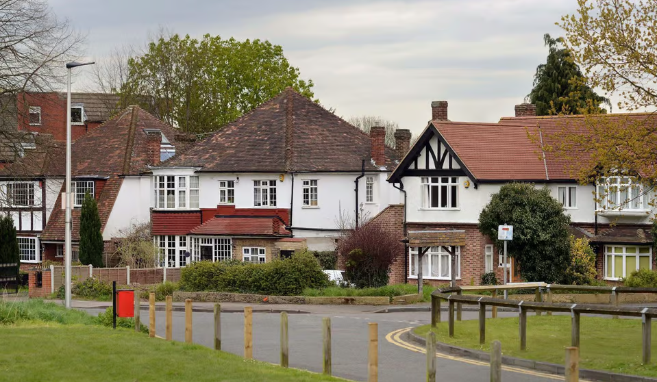
Harrow
Estimated median weekly workplace earnings: £757.30

Harrow is another borough where readers should check the metric carefully. It can appear in borough salary or earnings comparisons, but household income, resident earnings, and workplace earnings can point in different directions.
The right question is not “Is Harrow low paid?” The better question is: “Which Harrow measure are we talking about?”
Sutton
Estimated median weekly workplace earnings: £764.10

Sutton appears in Trust for London’s resident low-pay update because it had one of the largest increases in the proportion of low-paid residents from 2024 to 2025. Data as of January 2026.
That does not automatically make Sutton one of London’s poorest boroughs. Trust for London’s poverty grouping places Sutton below the London-average poverty rate. Data as of June 2025.
Why Median Weekly Earnings Can Tell A Different Story
Median weekly earnings tell you about typical pay, not the share of jobs under a living-wage threshold. Two boroughs can have similar medians but different numbers of very low-paid part-time workers.
That is why the strongest article on this topic should show the three lenses together, not choose one and pretend the others do not exist.
Why Outer London Often Appears In Low-Pay Rankings
This section explains the pattern behind the rankings. Outer London appears often because the structure of local work, commuting, housing, and part-time employment differs from the central job market.
Local Industry Mix
The type of jobs in a borough strongly affects low-pay rates. Trust for London reports that accommodation and food service has a high low-pay share, while finance and insurance has a much lower low-pay share. Data as of January 2026.
A borough with more hospitality, retail, cleaning, care, or elementary occupations will usually look different from a borough dominated by finance, professional services, or corporate headquarters.
Part-Time Work
Part-time work changes the picture sharply. Trust for London reports that 31.9% of part-time jobs in London were low paid in 2025, compared with 9% of full-time jobs. Data as of January 2026.
For readers, this matters because a borough can look relatively stable on full-time pay but still have a large low-paid part-time workforce.
Commuting Patterns
London’s boroughs are not sealed labour markets. A person can live in Barking and Dagenham, work in Westminster, and spend money in a third borough.
That is why resident low-pay data and workplace low-pay data answer different questions. Trust for London makes this distinction explicit by separating jobs held by borough residents from jobs located in London workplaces.
Housing And Transport Pressure
Low pay becomes more severe when rent and transport absorb a large share of income. Trust for London’s 2025 Minimum Income Standard research says rent and childcare are the main drivers of London’s higher living costs compared with the rest of the UK. Data as of March 2026.
For readers comparing pay against housing costs, our breakdown of average rent in London by boroughgives useful context beyond wages alone. If your main concern is finding lower-cost rental areas, start with the guide to the cheapest boroughs to rent in London.
So the real question is not just what someone earns. It is what remains after housing, travel, childcare, food, bills, and other essentials.
Low Pay Is Not The Same As Being A “Poor Borough”
This section protects readers from the most common misunderstanding. A low-pay ranking should never be used as a lazy substitute for a poverty ranking, deprivation ranking, or “worst borough” list.
Low Pay Vs Borough Poverty
Low pay is job-based. Borough poverty is household-based and usually measured after housing costs.
Trust for London’s poverty indicator pools five years of survey data and defines poverty as below 60% of median household income after housing costs. It places Camden, Westminster, Tower Hamlets, Newham, Hounslow, Redbridge, Brent, Barking and Dagenham, Enfield, and Ealing above the London-average poverty rate. Data as of June 2025.
Low Pay Vs Household Income
Household income can be higher or lower than individual pay because households vary. One household might have two full-time earners; another might have one part-time earner, children, or caring responsibilities.
Trust for London’s household-income indicator shows Brent as the lowest average gross household-income borough and Richmond upon Thames as the highest, but it also stresses sharp differences within boroughs. Data as of April 2026.
Low Pay Vs Cheap Rent
A lower-paid borough is not automatically a cheaper borough. Rents, transport zones, childcare costs, council tax, housing tenure, and access to jobs all affect affordability.
Trust for London’s poverty analysis says London’s poverty story is strongly shaped by high housing costs, with poor London households spending a much higher share of income on housing than poor households elsewhere in England. Data as of January 2026.
For readers, this is one of the most important practical points: a borough can have lower typical earnings and still be difficult to afford if housing, commuting, or childcare costs are high.
Why “Worst Boroughs In London” Is The Wrong Frame
“Worst borough” is a poor frame because it turns an economic measure into a stigma. Low pay reflects labour markets, sector mix, housing pressure, commuting patterns, and national wage policy.
A better frame is: which boroughs show the strongest signs of low-paid work, and what does that mean for residents, employers, and local decision-makers?
That brings us to the practical question: what does this pay data mean for living standards?
What Low Pay Means For Living Standards In London
This section connects borough rankings to everyday life. Pay only becomes meaningful when you compare it with London’s actual cost of living.
London’s low-pay problem is not only about rankings. The Living Wage Foundationreports that 574,000 jobs in London are low paid, equal to 13.3% of jobs, and warns that high living costs increase the risk of in-work poverty.
How The London Living Wage Compares With The Legal Minimum
As of April 2026, the legal National Living Wage for workers aged 21 and over is £12.71 per hour. Data as of April 2026; check GOV.UKfor the latest rate.
The London Living Wage for 2025/26 is £14.80 per hour. Data as of October 2025; check the Living Wage Foundation for the latest rate.
Worked example:For a 37.5-hour week, the gap is £2.09 per hour. That is £78.38 per week before tax and deductions, or about £4,075 per year before tax if paid for 52 weeks. The exact take-home difference depends on tax, National Insurance, pension contributions, hours, and employment pattern.
This example matters because the difference between the legal wage floor and the London Living Wage is not just a few pounds on paper. Across a full year, it can affect rent pressure, travel affordability, emergency savings, and whether a worker can absorb sudden costs.
How Pay Compares With The Minimum Income Standard
The London Living Wage is a vital benchmark, but it does not mean every household can meet every cost comfortably. Trust for London’s 2025 Minimum Income Standard report says a single adult in Inner London needs £54.4k a year for a decent standard of living. Data as of March 2026.
The same source says almost half of Londoners do not earn enough to reach the Minimum Income Standard. Data as of March 2026.
Why Rent And Childcare Change The Answer
Rent and childcare can completely change whether a salary feels liveable. Trust for London’s MIS research identifies rent and childcare as the main drivers of the difference between London and the rest of the UK. Data as of March 2026.
That is why two people on the same wage can experience London very differently. A single renter in Inner London, a parent paying childcare, and a homeowner with a small mortgage are not living the same financial reality.
Quick Comparison Table: Lowest Pay By Measure
This table gives readers a clean way to compare the main answers. Use it before quoting any “lowest-paid borough” claim.
| Measure | What it means |
| Resident low pay | Shows where low-paid workers live. Boroughs that stand out: Barking and Dagenham and Brent. Best source: Trust for London resident low-pay data. Caveat: does not show where the jobs are. |
| Workplace low pay | Shows where low-paid jobs are located. Borough that stands out: Redbridge. Best source: Trust for London workplace low-pay data. Caveat: includes commuters from outside the borough. |
| Median workplace earnings | Shows typical pay among employees working in the borough. Best source: London Datastore / ONS ASHE. Caveat: survey-based, so use caution with small samples. |
| Household income | Shows average household resources. Boroughs that stand out: Brent lowest, Richmond upon Thames highest. Best source: Trust for London household income data. Caveat: not the same as individual pay. |
| Poverty after housing costs | Shows whether household income is enough after rent or mortgage costs. Boroughs above the London-average poverty rate include Newham, Brent, Redbridge, Barking and Dagenham, Enfield, and Ealing. Best source: Trust for London poverty data. Caveat: pooled survey data, so uncertainty remains. |
The table’s main lesson is that the “lowest-paid borough” changes when the question changes.
How To Use This Data If You Are Moving, Hiring, Or Researching London
This section turns the data into practical judgement. The goal is not to memorise a ranking, but to use the right ranking for the right decision.
If You Are Moving Boroughs
Do not move based on pay data alone. Compare:
- Rent for your household size.
- Commute cost and time.
- Local job access.
- Childcare or caring costs.
- Expected take-home pay.
- Whether your work is remote, hybrid, or location-based.
A lower-paid borough may still be expensive for your household if rent, travel, and childcare are high.
If You Are Comparing Job Offers
Use the London Living Wage as a floor for evaluating hourly pay, but look beyond the headline rate. Hours, overtime, paid breaks, sick pay, pension, travel cost, and contract security all affect real value.
For hourly work, the difference between the legal minimum and the London Living Wage can be meaningful over a full year. For salaried work, calculate the implied hourly rate rather than relying on the annual figure alone.
If You Are An Employer
If your business operates in a borough with high workplace low pay, the data is a prompt to review pay structures, contracted hours, and outsourced roles. Low pay is often concentrated in sectors such as hospitality, retail, cleaning, care, and elementary occupations.
The strongest employer question is not “Are we legally compliant?” but “Are roles paid enough for London living costs?”
If You Are Researching Inequality
Use at least three sources together: Trust for London low-pay data, London Datastore/ONS earnings data, and poverty-after-housing-costs data. That prevents one metric from doing too much work.
Before you quote the ranking, check:
- Is it resident-based or workplace-based?
- Is it median, mean, or lower quartile?
- Is it hourly, weekly, or annual pay?
- Is it before or after housing costs?
- What month and year is the data from?
- Was the ranking based on the wage rate in force when the data was collected, or the latest announced wage rate?
- Does the ranking include only employees, or does it also cover self-employed workers?
That checklist is the best defence against misleading borough comparisons.
FAQs About London Boroughs With The Lowest Pay
What Is The Cheapest Borough To Live In London?
The cheapest borough depends on rent, transport, household size, and work location. Do not infer “cheapest” from low-pay data alone, because pay, rent, and poverty measure different things. For affordability, compare housing costs and take-home income together.
What Is The Lowest Salary To Live In London?
There is no single salary for every household. Trust for London’s 2025 Minimum Income Standard says a single adult in Inner London needs £54.4k a year for a decent standard of living. Data as of March 2026.
What Are The Low Income Boroughs In London?
Trust for London’s household-income data shows Brent with the lowest average gross household income and Richmond upon Thames with the highest. Data as of April 2026, based on 2022/23 estimates.
Is £27,000 London’s Living Wage?
Assuming you mean £27,000 a year, it is below the Minimum Income Standard cited for a single adult in Inner London. It may also translate differently depending on hours worked, tax, rent, and household costs. Data as of March 2026.
Can You Live On £1,000 A Month In London?
For most independent renters, £1,000 a month is unlikely to cover rent, bills, food, transport, and other essentials. It may be possible only with unusually low housing costs, shared support, or a very constrained budget.
Are Redbridge And Barking And Dagenham The Lowest-paid Boroughs?
They stand out under different measures. Redbridge stands out for workplace low pay, while Barking and Dagenham stands out for resident low pay. Data as of January 2026.
Why Do Different Sources Give Different Answers?
They use different measures. Some rank resident low pay, some rank workplace jobs, some use median weekly earnings, and some discuss household income or poverty after housing costs.
Which Boroughs Have The Highest Pay?
For workplace earnings, check the latest ONS/ASHE data through London Datastore. For household income, Trust for London’s 2022/23 borough data shows Richmond upon Thames with the highest average gross household income.
The Bottom Line
The most accurate answer is not a single borough name. London’s lowest-pay picture depends on whether you measure residents, workplaces, or typical earnings.
Barking and Dagenham and Brent are central to the resident low-pay story. Redbridge is central to the workplace low-pay story. Median weekly earnings require careful checking against the latest ONS/ASHE and London Datastore tables.
The useful habit is simple: before repeating any “lowest-paid borough” ranking, ask what the ranking actually measures.
The safest way to use this article is not to memorise one borough name, but to match the right data measure to the question you are asking. In London, that one question separates a helpful answer from a misleading one.
Jump to
London Boroughs With The Lowest Pay And What The Figures Mean
What “Lowest Pay” Means In London
The Three Ways To Rank London Boroughs By Lowest Pay
Lowest-Paid London Boroughs By Resident Low-Pay Prevalence
Lowest-Paid London Boroughs By Workplace Low-Pay Share
Lowest-Paid London Boroughs By Median Weekly Earnings
Why Outer London Often Appears In Low-Pay Rankings
Low Pay Is Not The Same As Being A “Poor Borough”
What Low Pay Means For Living Standards In London
Quick Comparison Table: Lowest Pay By Measure
How To Use This Data If You Are Moving, Hiring, Or Researching London
FAQs About London Boroughs With The Lowest Pay
The Bottom Line

James Rowley
Author
James Rowley is a London-based writer and researcher covering London life, cultural geography, London travel, live London webcam pages and selected public figures across entertainment, sport, business and public life.
For over 15 years, he has focused on verified sources, first-hand local context and clear explanations that help readers understand both places and people more deeply. His work combines street-level London knowledge with careful research into career credits, media work, business interests and, where relevant, transparently explained net worth estimates.
He writes and reviews articles published on LondonWebcam.
Latest Articles
Popular Articles